Tutorial Details
פרטי Tutorial
<!-- Social Media -->
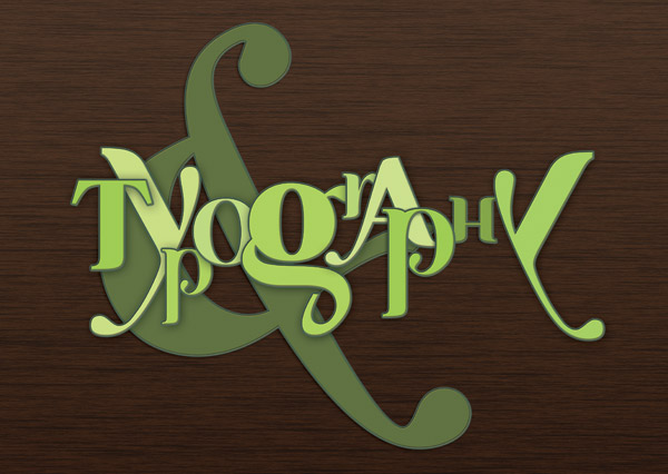
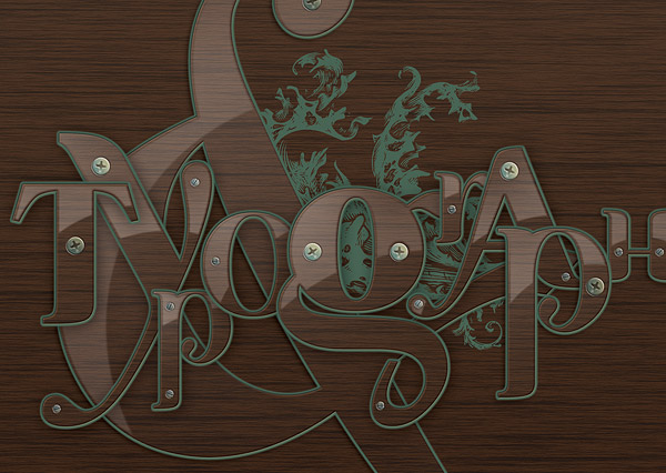
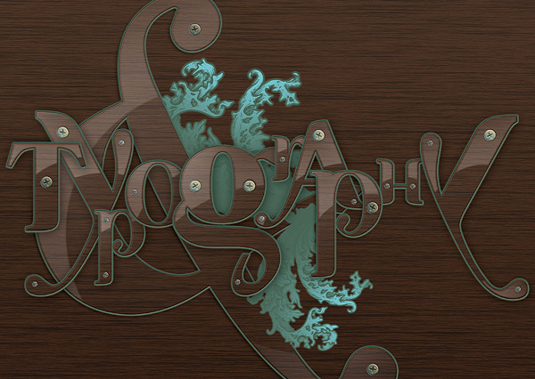
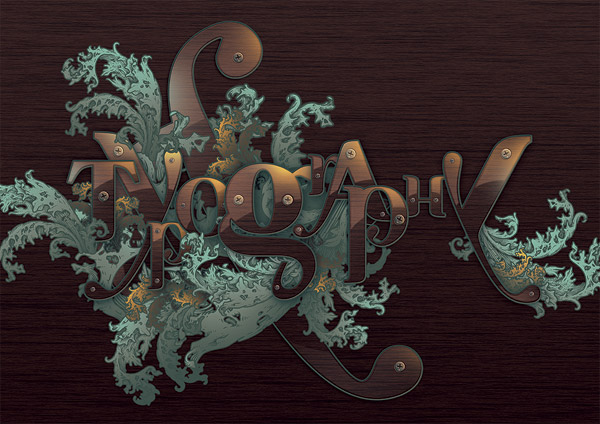
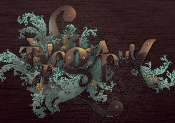
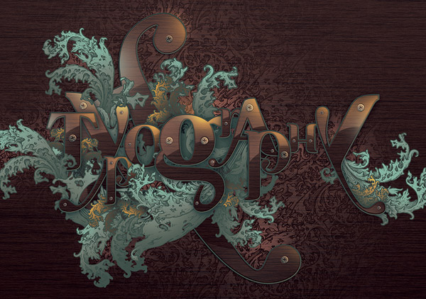
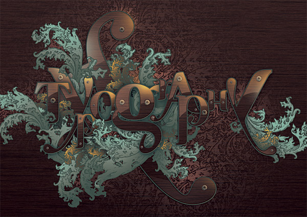
Final Product What You'll Be Creating
מוצר סופי מה יהיה יצירה
רשומה זו היא חלק 14 מתוך 19 באפקטי טקסט מאסטרינג המושב - Show All
«קודם הבא»
When looking for top quality content, you're usually forced to pay for your resources.
כאשר מחפשים תוכן איכותי, אתה בדרך כלל נאלץ לשלם על המשאבים שלך.
They're generally better and easier to work with, and offer a wider range of use.
הם בדרך כלל טובים יותר וקלים יותר לעבוד איתו, ומציעים מגוון רחב יותר של שימוש.
Sometimes though, you can find the same level of quality at zero cost, and it's exactly what we're going to do today.
כי לפעמים, אתה יכול למצוא את אותה הרמה של איכות באפס העלות, וזה בדיוק מה שאנחנו הולכים לעשות היום.
We're going to create a detailed illustration with free gifts and self made goodies.
אנחנו הולכים ליצור איור מפורט עם מתנות חינם ודברים טובים שנעשו עצמיים.
<HR style="TEXT-ALIGN: right; DIRECTION: rtl">
Video Tutorial
מדריך וידאו
Our video editor
Gavin Steele has created this video tutorial to compliment this text + image tutorial.
הווידאו שלנו עורך
גאווין סטיל יצר סרטון וידאו זה כדי להחמיא הטקסט הזה + הדרכת תמונה.
<HR style="TEXT-ALIGN: right; DIRECTION: rtl">
Introduction
מבוא
I love doing type treatments.
אני אוהב לעשות טיפולים מסוג.
Out of all the designs I've created so far, it's typographic illustrations that have always taught me a lot, mainly because I've usually tried to make the most of Photoshop and Illustrator's tools.
מתוך כל העיצובים שיצרתי עד כה, זה איורים טיפוגרפיים שתמיד למדו אותי הרבה, בעיקר כי בדרך כלל אני כבר ניסיתי להפיק את המירב מהכלים של Photoshop ו Illustrator.
You are practically forced to create most of it from scratch, so how much you polish your design determines how good it will be.
אתם נאלצים כמעט כדי ליצור רובו מההתחלה, ולכן כמה אתה ללטש את העיצוב שלך קובע כמה טוב הוא יהיה.
In this tutorial, I went for a decorative look, by firstly choosing a typeface:
Ayosmonika .
במדריך זה, אני הלכתי למראה דקורטיבי, על ידי בחירת גופן ראשית:
Ayosmonika. I've used it before, and this time I wanted to go for a more flat look.
אני השתמשתי בו בעבר, והפעם אני רוצה ללכת על מראה שטוח יותר.
The font seems very organic to me, so I sought and found a good online resource, the
ornate pattern freebie.
הגופן נראה מאוד האורגני ל, אז חפש ומצא משאב מקוון טוב,
הדפוס המצועצע freebie.
It's got lots of rich detail, so it's enough for what we want.
יש בזה הרבה פרטים עשירים, כך שזה מספיק בשביל מה שאנחנו רוצים.
My initial colors were violet and yellow, but they seemed out of place.
הצבעים הראשוניים שלי היו סגולים וצהובים, אבל הם לא התאימו למקום.
I later decided to go with a wood texture, and bronze shades (new and aged) for the decorative elements.
מאוחר יותר החלטתי ללכת עם מרקם עץ, וגווני ברונזה (חדש ומבוגר) לאלמנטים הדקורטיביים.
These colors would give me an old-world look, so even though it's not how it began, it is how it ended.
צבעים אלה היו נותנים לי מראה של עולם הישן, ולכן למרות שזה לא איך זה התחיל, ככה זה נגמר.
<HR style="TEXT-ALIGN: right; DIRECTION: rtl">
Step 1
שלב 1
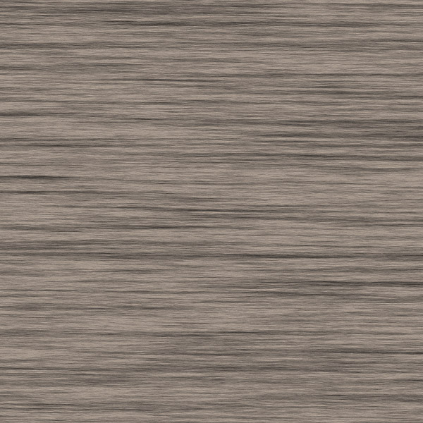
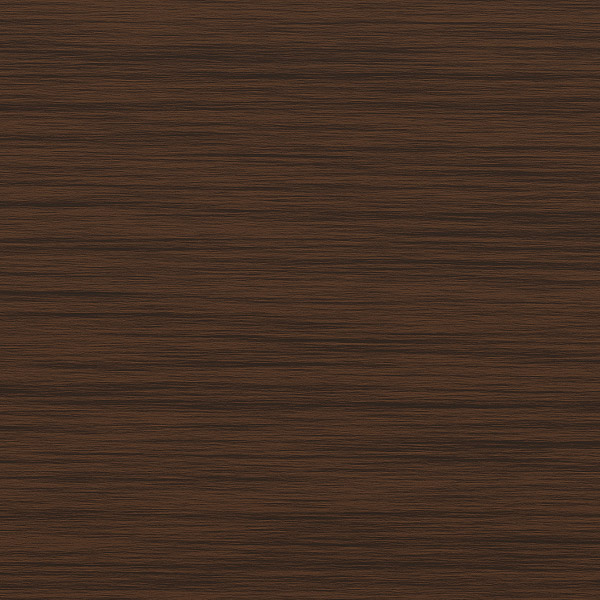
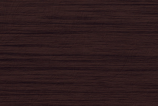
The first thing we'll do is create a very large wooden texture.
הדבר הראשון שנעשינו הוא ליצור מרקם עץ גדול מאוד.
Getting the same result may be difficult, so just try to obtain something that looks like a wood texture.
מקבל את אותה התוצאה עלולה להיות קשה, כל כך פשוט לנסות להשיג משהו שנראה כמו מרקם עץ.
Start up Photoshop and create a new document.
התחל את פוטושופ וליצור מסמך חדש.
Make it big; somewhere around 6000 px by 6000 px (300 ppi).
להפוך אותו גדול; איפשהו בסביבות 6000 פיקסלים על ידי 6000 פיקסלים (300 ppi).
Select a dark brown (#48403a) as the foreground color and a lighter version (#ac9f92) as the background color.
בחר בצבע חום כהה (# 48403a) כצבע חזית וגרסה קלה יותר (# ac9f92) כצבע רקע.
Fill the document's background with the foreground color (#48403a) and go to Filter > Render > Fibers.
מלא את הרקע של המסמך עם צבע החזית (# 48403a) וללכת לFilter> Render> סיבים.
Change the settings (Variance of 12.0 and Strength of 34.0) and randomize it until you get something similar.
לשנות את ההגדרות שונות של 12.0 (וחוזק של 34.0) וrandomize זה עד שאתה מקבל משהו דומה.
Playing around with the settings can help.
לשחק עם ההגדרות יכול לעזור.
או: אם אתה
נהר גרפי למשתמש, אתה יכול להוריד מרקם דומה משלי
חבילת מרקם עץ.
<HR style="TEXT-ALIGN: right; DIRECTION: rtl">
Step 2
שלב 2
We'll now give the fibers more depth and a darker color.
עכשיו אנחנו ניתן את הסיבים יותר עומק וצבע כהה יותר.
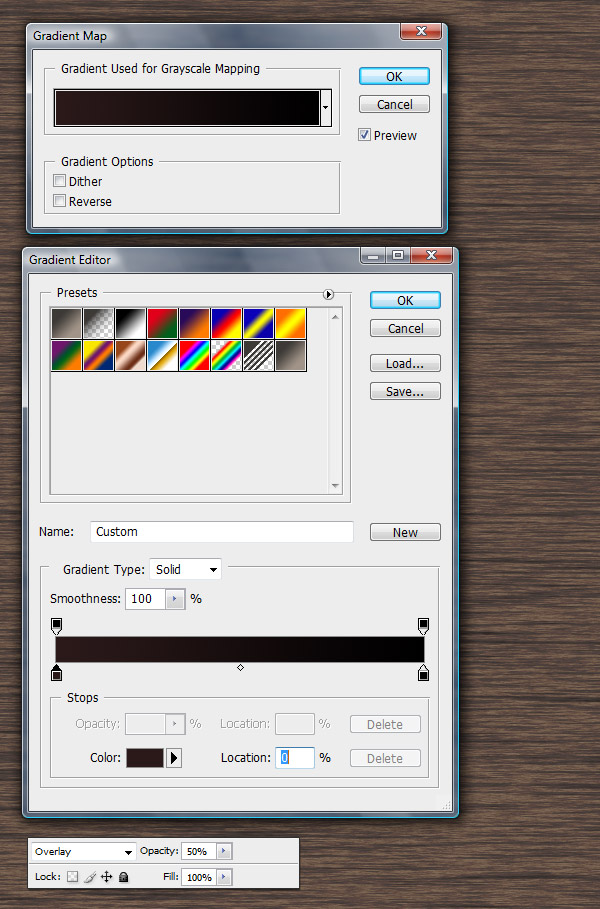
Go to Layer > New Adjustment Layer > Gradient Map.
עבור לLayer> שכבת התאמה חדשה> מפה מעבר צבע '.
Once you created it, change its layer Blending Mode to Overlay and Opacity to 50%.
ברגע שיצרת אותו, לשנות את מצב blending שכבתו כדי כיסוי ואטימות ל 50%.
<HR style="TEXT-ALIGN: right; DIRECTION: rtl">
Step 3
שלב 3
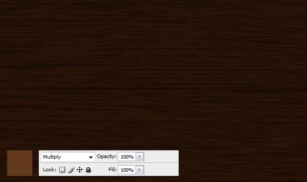
Now create a new blank layer and fill it with the color #633a1c.
עכשיו ליצור שכבה חדשה ריקה ולמלא אותו עם הצבע # 633a1c.
Set the layer's Blending Mode to Multiply.
הגדרת מצב המיזוג של השכבה כדי להתרבות.
<HR style="TEXT-ALIGN: right; DIRECTION: rtl">
Step 4
שלב 4
And finally, select the Gradient Tool (G).
ולבסוף, בחר את כלי Gradient (G).
Choose white as the foreground color, and create a white to transparent white gradient from top to bottom.
בחר לבן כצבע חזית, וליצור לבן לצבע לבן שקוף מלמעלה ועד למטה.
Change the layer Opacity to somewhere around 10%.
שנה את אטימות השכבה ל איפשהו סביב 10%.
Select the entire canvas (Command + A) and copy the merged file (Command + Shift + C).
בחר כל הבד (Command +) ולהעתיק את הקובץ הממוזג (Command + Shift + C).
<HR style="TEXT-ALIGN: right; DIRECTION: rtl">
Step 5
שלב 5
Create a new Photoshop document using a landscape A4 canvas (29,7 x 21 cm at 300 ppi).
צור מסמך חדש באמצעות פוטושופ בד A4 נוף (29,7 21 סנטימטר ב300 ppi).
I created mine in CMYK format, so if you want the colors to make any sense, make sure you select CMYK, not RGB.
אני יצרתי אותי בפורמט CMYK, כך שאם אתה רוצה את הצבעים לכל היגיון, הקפידו לבחור CMYK, ולא RGB.
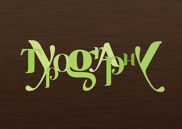
Now add the type to this new document.
עכשיו תוסיף לסוג המסמך החדש.
הורד
גופן זה בחינם וסוג בכל אות בשכבה נפרדת.
The color doesn't matter, as it will be replaced by a texture.
הצבע לא משנה, כפי שהוא יוחלף במרקם.
I chose different shades of green just to show the layer order.
אני בחרתי גוונים שונים של ירוק רק כדי להראות את סדר השכבה.
<HR style="TEXT-ALIGN: right; DIRECTION: rtl">
Step 6
שלב 6
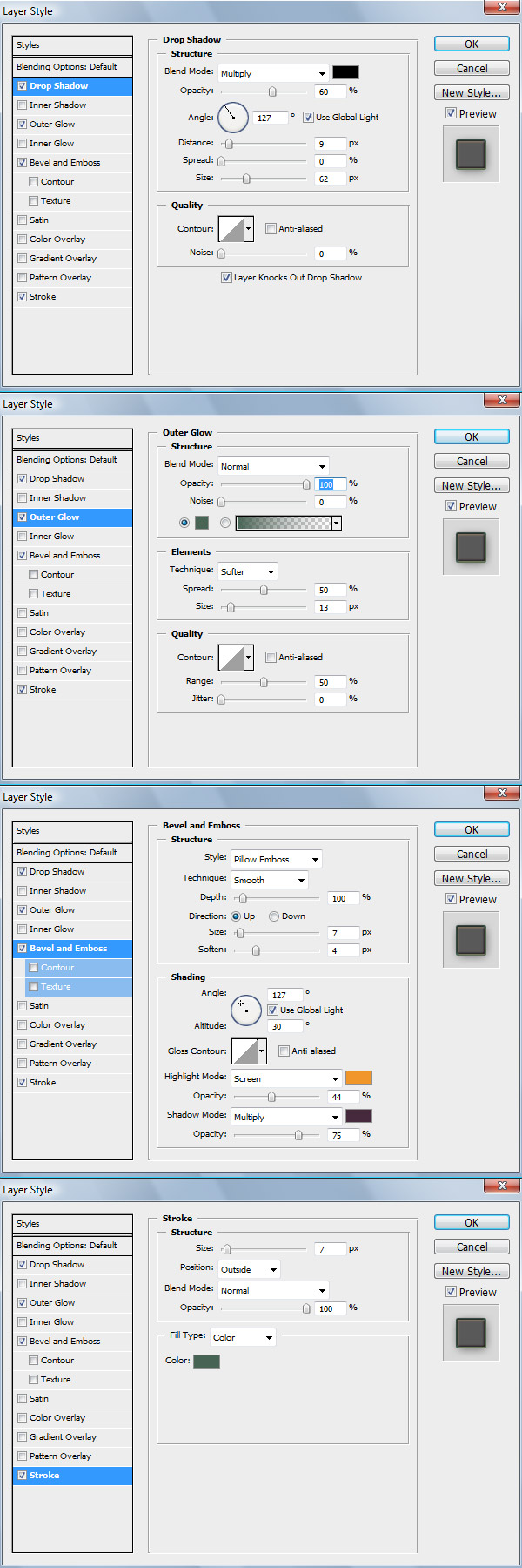
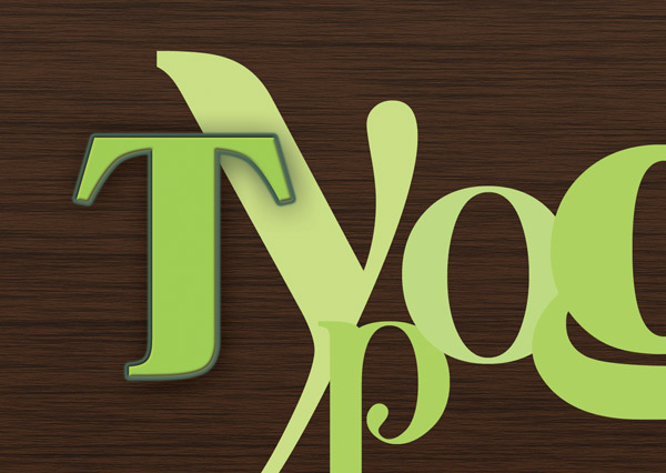
Now double-click on the letter “T” layer and add these effects.
כעת לחץ פעמים על שכבת המכתב "T" ולהוסיף את ההשפעות הללו.
Here are the color codes for each of them: Drop Shadow set to #000000; Outer Glow set to #476454; Bevel and Emboss Highlight set to #f09629 and Shadow set to #45293c, and Stroke set to #466454.
להלן קודי צבע לכל אחד מהם: 'הצללה מוגדרת # 000000; זוהר חיצוני מוגדר # 476454;' בלטה ושיקוע הדגש המוגדר # f09629 והצל המוגדר # 45293c, ולהגדיר לשבץ # 466454.
Altogether, your effects should look like the image below.
בסך הכל, ההשפעות שלך צריכות להיראות כמו בתמונה למטה.
<HR style="TEXT-ALIGN: right; DIRECTION: rtl">
Step 7
שלב 7
Copy the layer style (right-click on layer and go to Copy Layer Style) and paste it over the rest.
העתק סגנון השכבה (קליק ימני על שכבה וללכת להעתק סגנון שכבה) ולהדביק אותו על פני השאר.
Also, create a large ampersand behind all the letters.
כמו כן, ליצור אמפרסנד גדול מאחורי כל האותיות.
<HR style="TEXT-ALIGN: right; DIRECTION: rtl">
Step 8
שלב 8
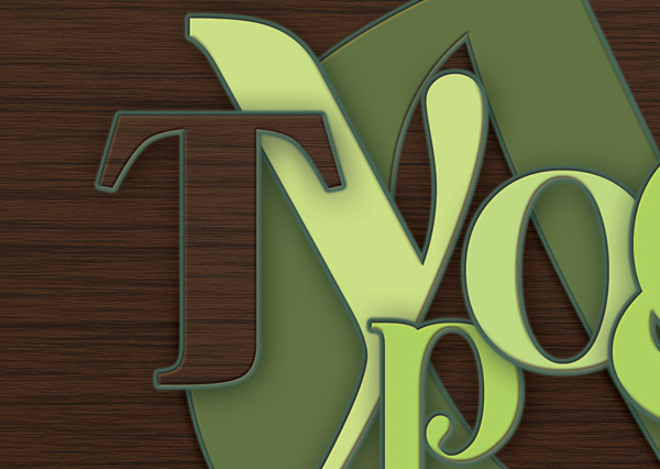
Create a new blank layer above the letter “T” and make it a clipping mask.
יצירת שכבה חדשה ריקה מעל האות "T" ולהפוך אותו למסיכה.
Place the wooden texture inside .
הנח
בתוך מרקם העץ.
<HR style="TEXT-ALIGN: right; DIRECTION: rtl">
Step 9
שלב 9
Create another blank layer as a clipping mask above the texture.
צור שכבה נוספת ריקה כמסיכה מעל המרקם.
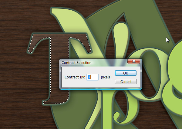
Make a selection of the “T” layer (Command + Click on the layer icon) and contract it by seven pixels (Select > Modify > Contract).
לבצע בחירה של השכבה "T" (פיקוד + לחץ על סמל השכבה) וחוזה זה על ידי שבעה פיקסלים (בחר> שינוי> חוזה).
<HR style="TEXT-ALIGN: right; DIRECTION: rtl">
Step 10
שלב 10
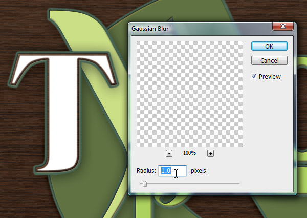
Fill it with white and blur it slightly (Filter > Blur > Gaussian Blur).
מלא אותו בלבן ולטשטש אותו מעט (Filter> Blur> Gaussian Blur).
<HR style="TEXT-ALIGN: right; DIRECTION: rtl">
Step 11
שלב 11
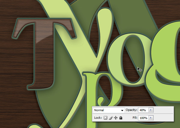
Change the Layer's opacity to 40% and select the eraser tool (E).
השינוי של אטימות השכבה ל 40% ובחרו את כלי המחק (E).
Make it about 80% soft and erase the bottom part.
תעשה את זה על 80% רכים ולמחוק את החלק התחתון.
<HR style="TEXT-ALIGN: right; DIRECTION: rtl">
Step 12
שלב 12
קבל
את זה וזה בורג.
Cut them out with the pen tool and desaturate them (Command + Shift + U).
לחתוך אותם עם כלי העט וdesaturate (Command + Shift + U).
We'll use the first one for large screws and the second for smaller ones.
אנו נשתמש בראשונים לברגים גדולים ושני לקטנים.
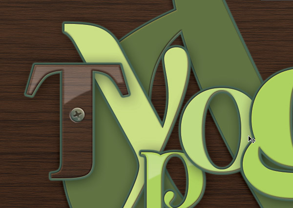
Place one of the large ones in the middle of the “T” and apply the effects shown below.
מקום אחד מאלה הגדולים באמצע "T" ולהחיל את ההשפעות המוצגות להלן.
<INS style="POSITION: relative; PADDING-BOTTOM: 0px; MARGIN: 0px; PADDING-LEFT: 0px; WIDTH: 300px; PADDING-RIGHT: 0px; DISPLAY: inline-table; HEIGHT: 250px; VISIBILITY: visible; PADDING-TOP: 0px"><INS style="POSITION: relative; PADDING-BOTTOM: 0px; MARGIN: 0px; PADDING-LEFT: 0px; WIDTH: 300px; PADDING-RIGHT: 0px; DISPLAY: block; HEIGHT: 250px; VISIBILITY: visible; PADDING-TOP: 0px" id=aswift_0_anchor><IFRAME style="POSITION: absolute; TOP: 0px; LEFT: 0px" id=aswift_0 height=250 marginHeight=0 frameBorder=0 width=300 allowTransparency name=aswift_0 marginWidth=0 scrolling=no></IFRAME></INS></INS>
It will now look like it's holding the “T” in place.
זה יהיה עכשיו נראה שזה מחזיק "T" במקום.
<HR style="TEXT-ALIGN: right; DIRECTION: rtl">
Step 13
שלב 13
Do the same to create the smaller one and place these screws on all the letters.
לעשות את אותו הדבר כדי ליצור את אחד הקטן ולמקם את הברגים האלה על כל האותיות.
<HR style="TEXT-ALIGN: right; DIRECTION: rtl">
Step 14
שלב 14
כעת יהיה עליך חופשי זה
דפוס מצועצע. Open it in Illustrator and double-click on the flourish detail (not the pattern).
לפתוח אותו באילוסטרייטור וללחוץ לחיצה כפולה על הפרט לפרוח (לא הדפוס).
Use the Direct Selection Tool (A) to select a white part of the detail.
השתמש בכלי הבחירה הישירים () כדי לבחור חלק לבן של הפרט.
Change its color to #486554, Copy it (Command + C) and paste it (Command + V) into the Photoshop file as a Smart Object.
לשנות את הצבעים ל# 486554, העתק אותו (Command + C) ולהדביק אותו (Command + V) לתוך קובץ Photoshop כאובייקט חכם.
<HR style="TEXT-ALIGN: right; DIRECTION: rtl">
Step 15
שלב 15
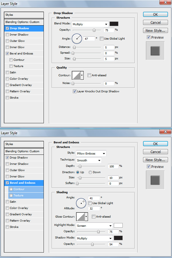
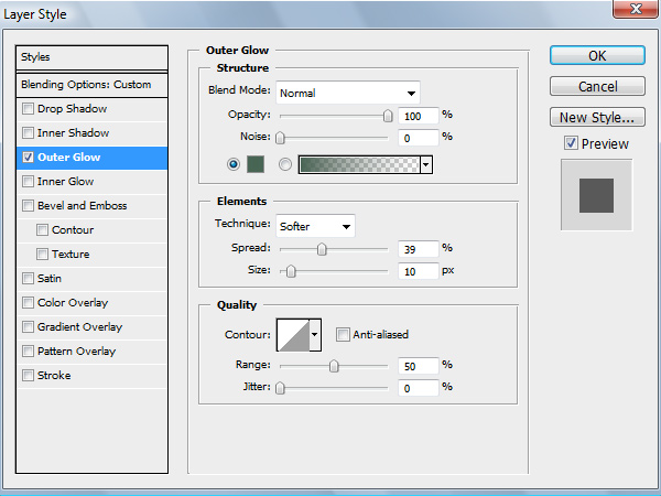
Now add this layer style shown below.
עכשיו להוסיף סגנון שכבה זו מוצגת להלן.
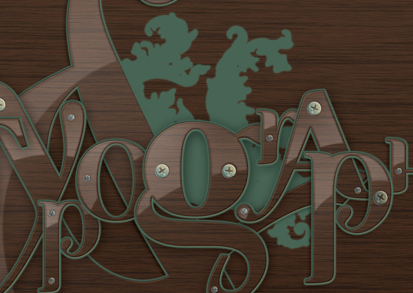
It looks odd now, but it will be better once we add the second color.
זה נראה מוזר עכשיו, אבל זה יהיה יותר טוב ברגע שמוסיפים את הצבע השני.
<HR style="TEXT-ALIGN: right; DIRECTION: rtl">
Step 16
שלב 16
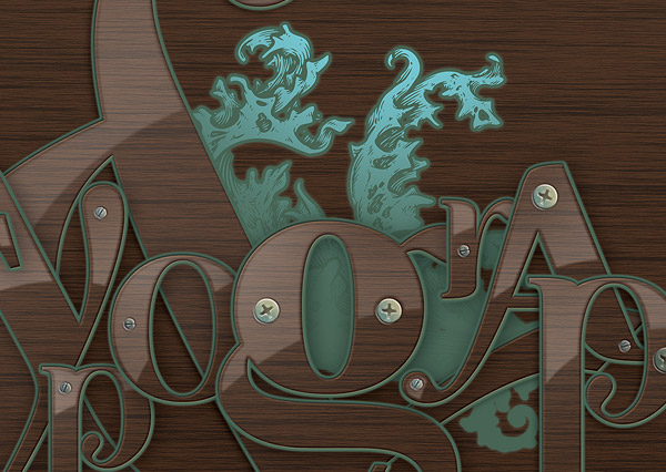
Create a new blank layer as a clipping mask and paint (#74cdd8) with a soft brush the tips of the flourish detail.
יצירת שכבה חדשה ריקה כמסיכה וצבע (# 74cdd8) עם מברשת רכה הקצוות לפרוח פירוט.
<HR style="TEXT-ALIGN: right; DIRECTION: rtl">
Step 17
שלב 17
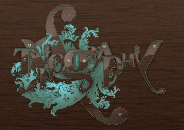
Group the layers (Command + G) and duplicate the group, then position it accordingly.
קבוצת השכבות (Command + G) ולשכפל את הקבוצה, ואז למקם אותו בהתאם.
<HR style="TEXT-ALIGN: right; DIRECTION: rtl">
Step 18
שלב 18
Place a large one on the bottom.
הנח אחד גדול בתחתית.
<HR style="TEXT-ALIGN: right; DIRECTION: rtl">
Step 19
שלב 19
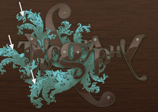
Add a few smaller ones that appear to come out of the large one underneath.
הוסף כמה קטן יותר שנראים כאילו הגיע מתוך זה שמתחת גדול.
Try to keep an orientation that feels natural and organic.
נסה לשמור על אורינטציה שמרגישה טבעי ואורגני.
<HR style="TEXT-ALIGN: right; DIRECTION: rtl">
Step 20
שלב 20
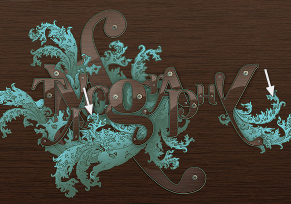
Add the final ones too.
הוסף את אלה סופיים מדי.
<HR style="TEXT-ALIGN: right; DIRECTION: rtl">
Step 21
שלב 21
As usual, we'll adjust the colors and contrast of the document with good ol' Adjustment Layers.
כרגיל, תתאים את הצבעים והקונטרסט של המסמך עם שכבות התאמה טובה ol '.
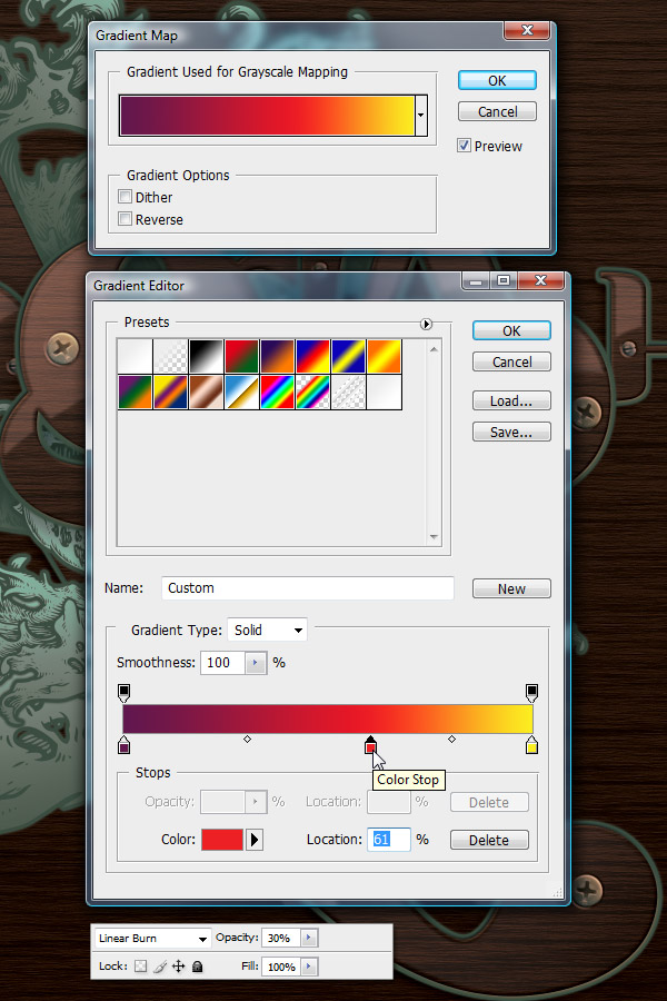
Add the first one by going to Layer > New Adjustment Layer > Gradient Map.
הוסף ראשון על ידי הולך לשכבה> שכבת התאמה חדשה> המפה מעבר צבע '.
<HR style="TEXT-ALIGN: right; DIRECTION: rtl">
Step 22
שלב 22
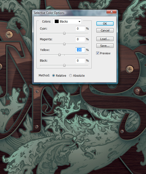
Now add a Selective Color Adjustment Layer and use the Colors drop down menu to get to Blacks.
עכשיו להוסיף שכבת התאמת צבע בררנית ולהשתמש בצבעים בתפריט נפתח כדי להגיע לשחורים.
<HR style="TEXT-ALIGN: right; DIRECTION: rtl">
Step 23
שלב 23
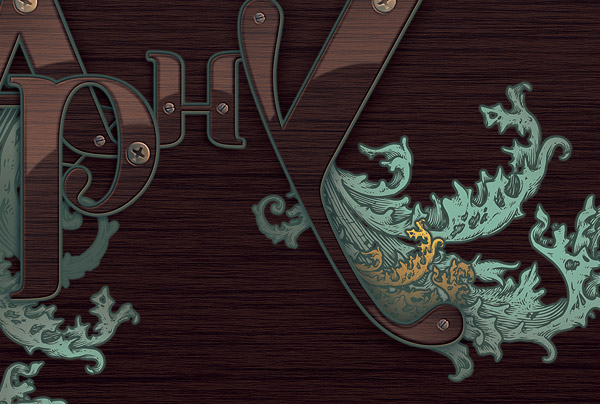
I thought the composition needed a touch of another color, so let's add some orange.
חשבתי שהרכב צורך מגע של צבע אחר, אז בואו להוסיף קצת כתומה.
Duplicate one of the floral patterns and make it smaller.
שכפל אחד מדפוסי הפרחים ולהפוך אותו קטן יותר.
Delete the bright cyan and paint with this color instead: #f7db58.
מחק ציאן וצבע עם הצבע הזה במקום הבהיר: # f7db58.
<HR style="TEXT-ALIGN: right; DIRECTION: rtl">
Step 24
שלב 24
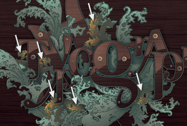
Add a few more.
הוסף עוד כמה.
<HR style="TEXT-ALIGN: right; DIRECTION: rtl">
Step 25
שלב 25
Now, make a selection of each letter and paint with the same color.
כעת, לבצע בחירה של כל אות וצבע עם אותו הצבע.
<HR style="TEXT-ALIGN: right; DIRECTION: rtl">
Step 26
שלב 26
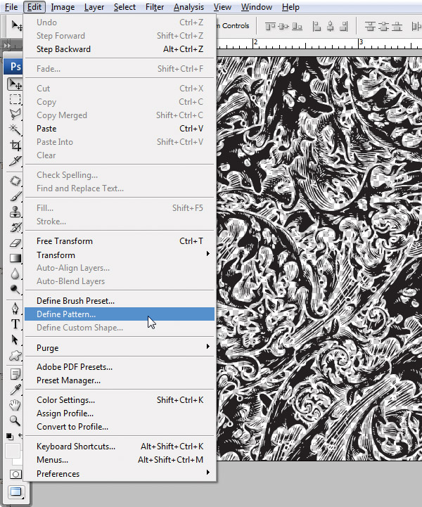
Go back to the Go Media Illustrator file and double-click the ornate pattern this time.
חזור לקובץ מדיה גו המאייר ולחץ פעמים על הדפוס המצועצע שלב זה.
Select the white part, and make it black.
בחר את החלק הלבן, ולעשות את זה שחור.
Copy it and go to Photoshop.
העתק אותו וללכת לפוטושופ.
Create a new document and keep the Clipboard size.
צור מסמך חדש ולשמור את גודל הלוח.
Paste the pattern into the new document that should be an exact fit.
הדבק את התבנית למסמך החדש שצריכה להיות התאמה מדויקת.
Make the Background layer invisible and go to Edit > Define Pattern.
להפוך את שכבת רקע בלתי נראית והולך לערוך> גדר תבנית.
<HR style="TEXT-ALIGN: right; DIRECTION: rtl">
Step 27
שלב 27
Create a new blank layer above the wood texture background in our illustration.
יצירת שכבה חדשה ריקה מעל רקע מרקם העץ באיור שלנו.
Select the Bucket Tool, and click on the drop down menu to paint a pattern.
בחר את כלי הדלי, ולחץ על התפריט הנפתח כדי לצייר דפוס.
Select the newly created one and create one in the blank layer.
בחר את אחד חדש שנוצר וליצור אחד בשכבה הריקה.
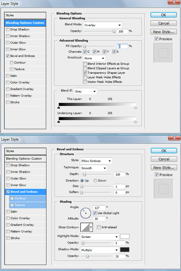
Add the layer styles shown below.
הוסף את סגנונות שכבה המוצגים להלן.
This is what you should see at 100%.
זה מה שאתה אמור לראות ב 100%.
<HR style="TEXT-ALIGN: right; DIRECTION: rtl">
Step 28
שלב 28
Create a new layer, make it a clipping mask and paint with a very large, soft shadow a few white glows near the center.
יצירת שכבה חדשה, להפוך אותו למסיכה וצבע בצל גדול מאוד, רך כמה זוהר לבן קרוב למרכז.
Keep the Opacity low so that they don't become too obvious.
שמור את האטימות נמוכות, כך שהם לא יהפכו ליותר מדי ברורים.
<HR style="TEXT-ALIGN: right; DIRECTION: rtl">
Step 29
שלב 29
Use the same orange to paint a few subtle glows in a few places, just like in the previous layer.
השתמש באותו כתום לצייר כמה זוהר עדין בכמה מקומות, כמו בשכבה הקודמת.
<HR style="TEXT-ALIGN: right; DIRECTION: rtl">
Conclusion
מסקנה
Finding the right resources can be a great way to eventually create your own typographic illustrations.
מציאת המשאבים הנכונים יכולה להיות דרך מצוינת סופו של דבר ליצירת איורים טיפוגרפיים משלך.
It's like learning from others before you do everything by yourself.
זה כמו ללמוד מאחרים לפני שאתה עושה הכל בעצמך.
In time, you'll be able to create details that are not only of the same or even better quality, but also something that reflects your style.
עם זמן, תוכל ליצור פרטים שאינם רק שלו, או אפילו טובה יותר באיכות, אלא גם משהו שמשקף את הסגנון שלך.
And hopefully, I'll be able to write a tutorial about that some day!
ואני מקווה שאני אהיה מסוגל לכתוב מדריך על זה ביום מן הימים!
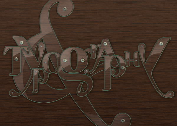
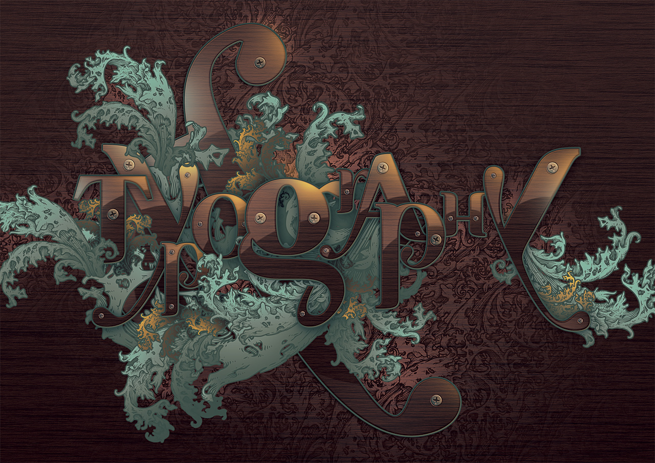
You can view the final image below.
אתה יכול להציג את התמונה הסופית בהמשך.
Be sure to view the
larger format , as there are details you miss at small sizes.
הקפד להציג את
הפורמט הגדול יותר, שכן יש פרטים שאת מתגעגעת בגדלים קטנים.
 הנושאים החמים